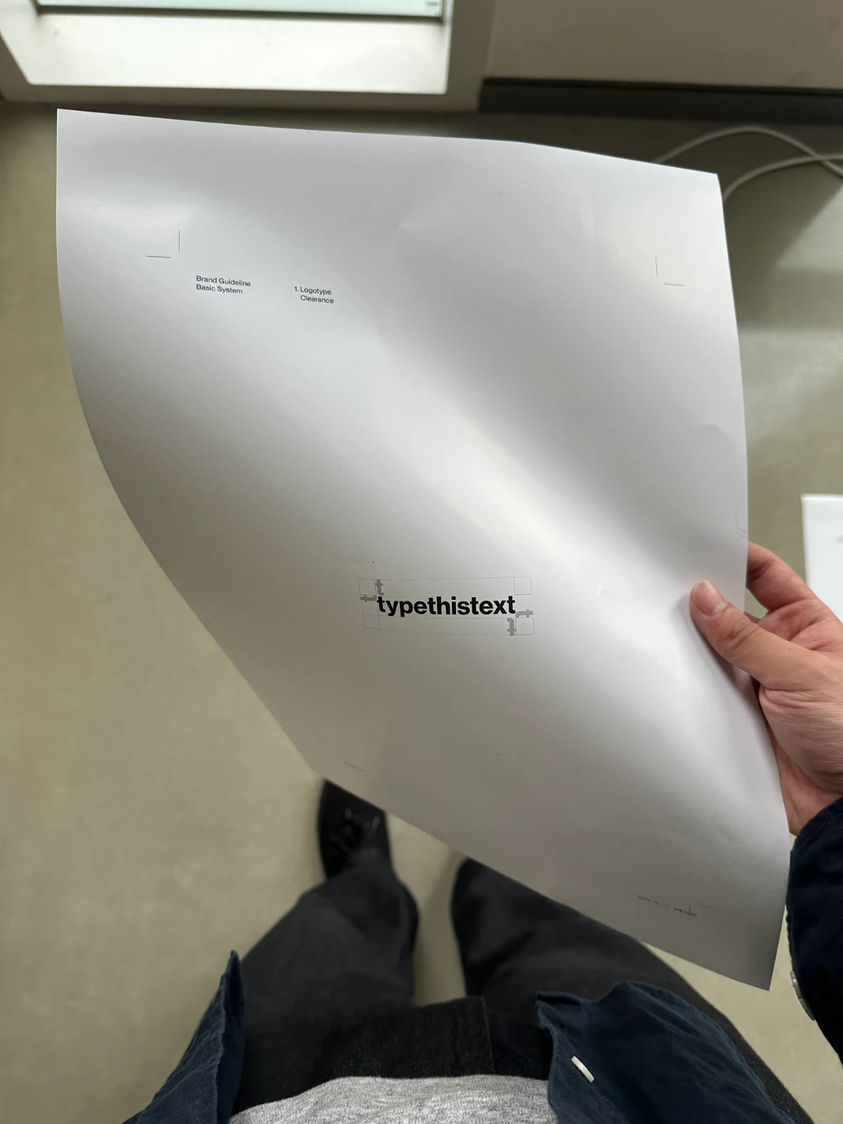
typethistext
2025
작업 범위: 심볼 디자인, 로직 설계, 패키지 디자인 Scope: Symbol Design, Visual Logic Development, Package Design
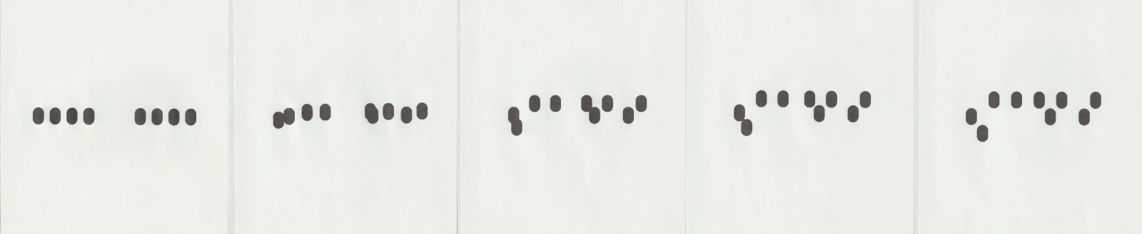
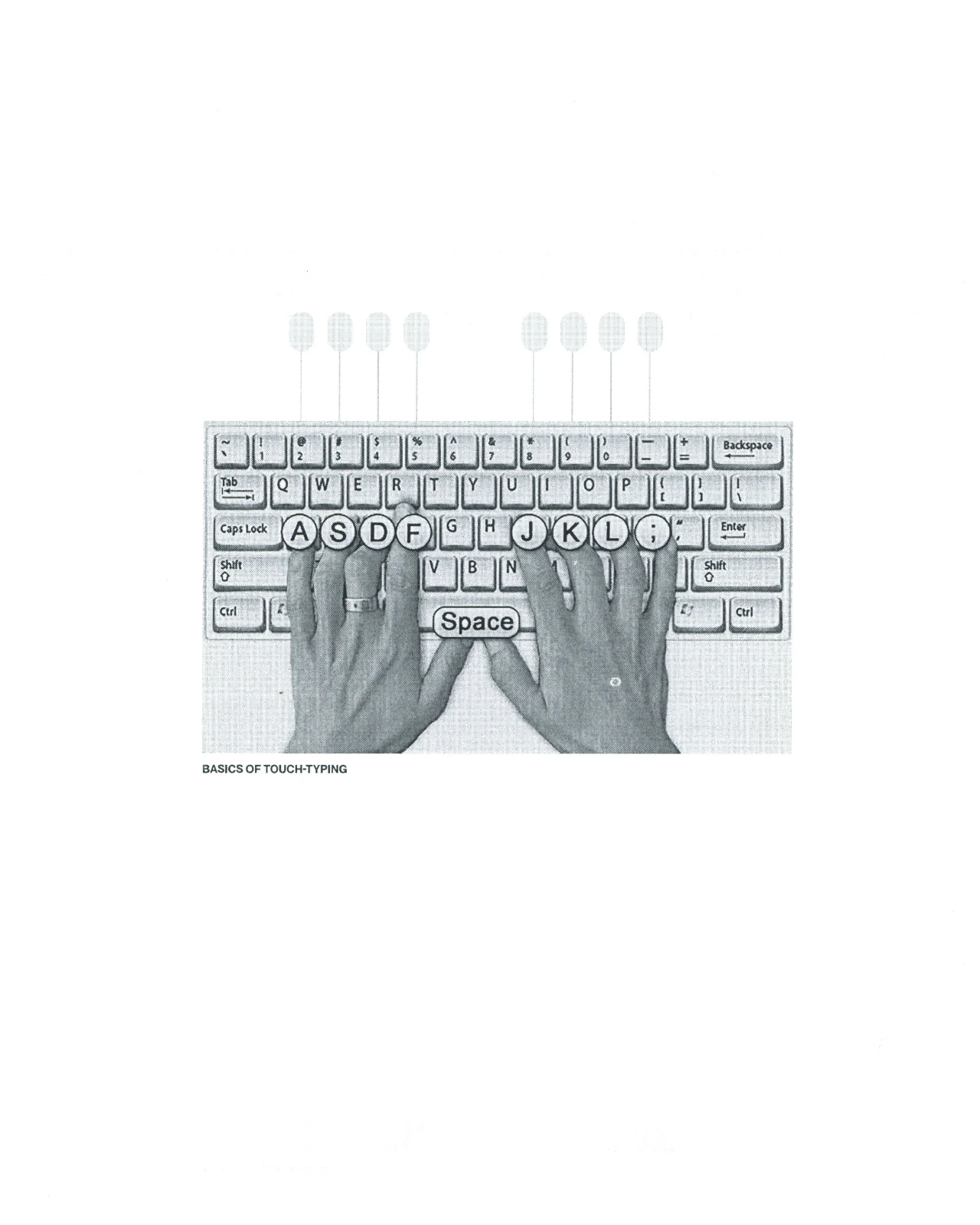
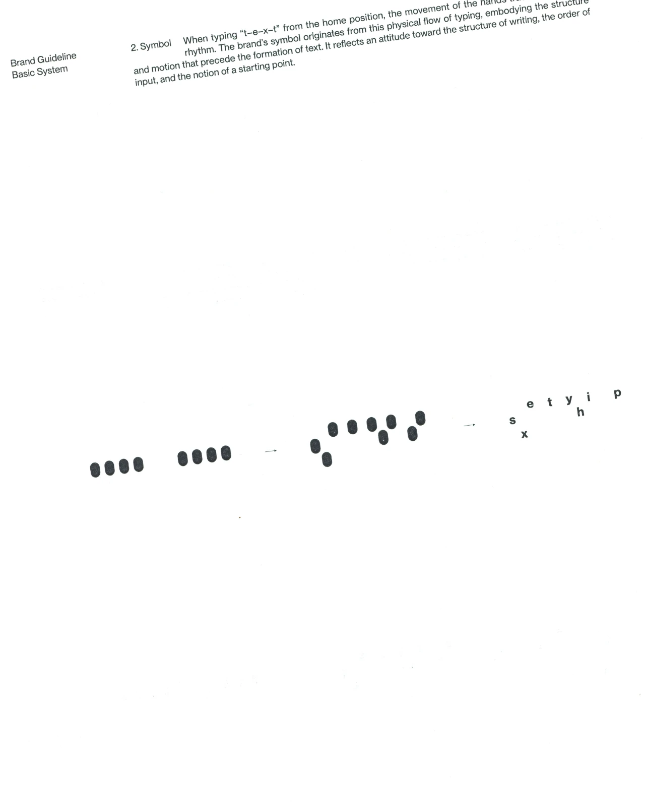
심볼과 브랜드 로직은 키보드의 홈 포지션에서 출발한다. 홈 포지션은 손가락이 타이핑의 시작과 끝마다 되돌아오는 기준점이자, 가장 효율적인 입력을 위해 강요된 표준 위치다. 타이프디스텍스트의 심볼은 상호의 철자(t, y, p, e, t, h, i, s, t, e, x, t)를 입력할 때 발생하는 손가락의 위치와 위상을 바탕으로 설계되었다. 이를 통해 홈 포지션은 단순한 사용법이 아니라, 텍스트 생산을 가능하게 하는 최소 단위이자 반복을 훈련하는 리듬의 구조로 읽힌다. 의뢰: 타이프디스텍스트
The symbol and brand logic begin with the keyboard’s home position. The home position is the point to which the fingers return at the beginning and end of typing, as well as a standardized position imposed in the name of efficient input. The symbol for typethistext is based on the positions and relations of the fingers used to type its letters (t, y, p, e, t, h, i, s, t, e, x, t). In this way, the home position is read not simply as a method of use, but as the smallest unit that enables text production and as a rhythmic structure that trains repetition. Client: typethistext(ttt)