≪british≫ Poster
2026
디지털 프린트 Digital Print
420×594(mm)
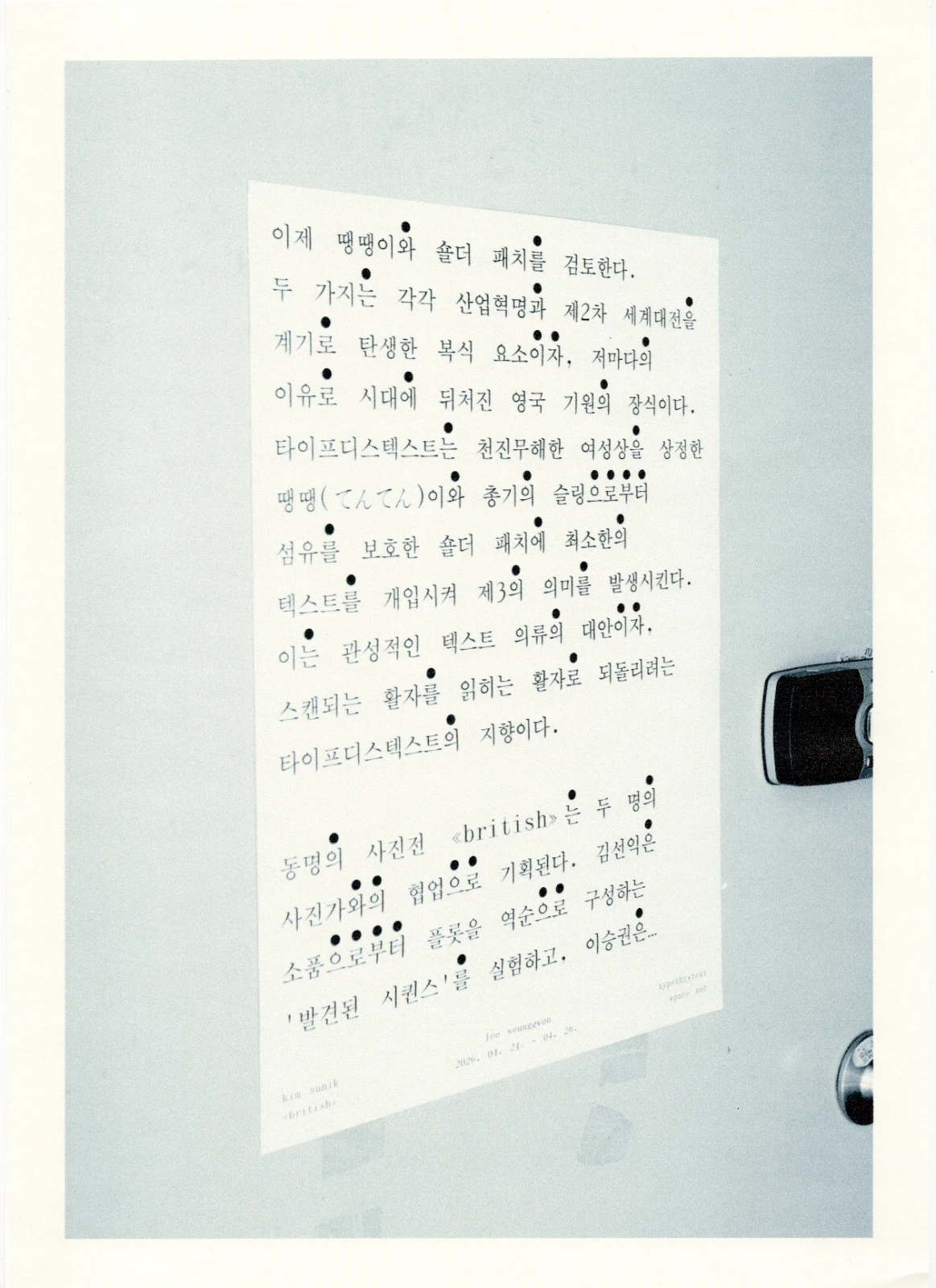
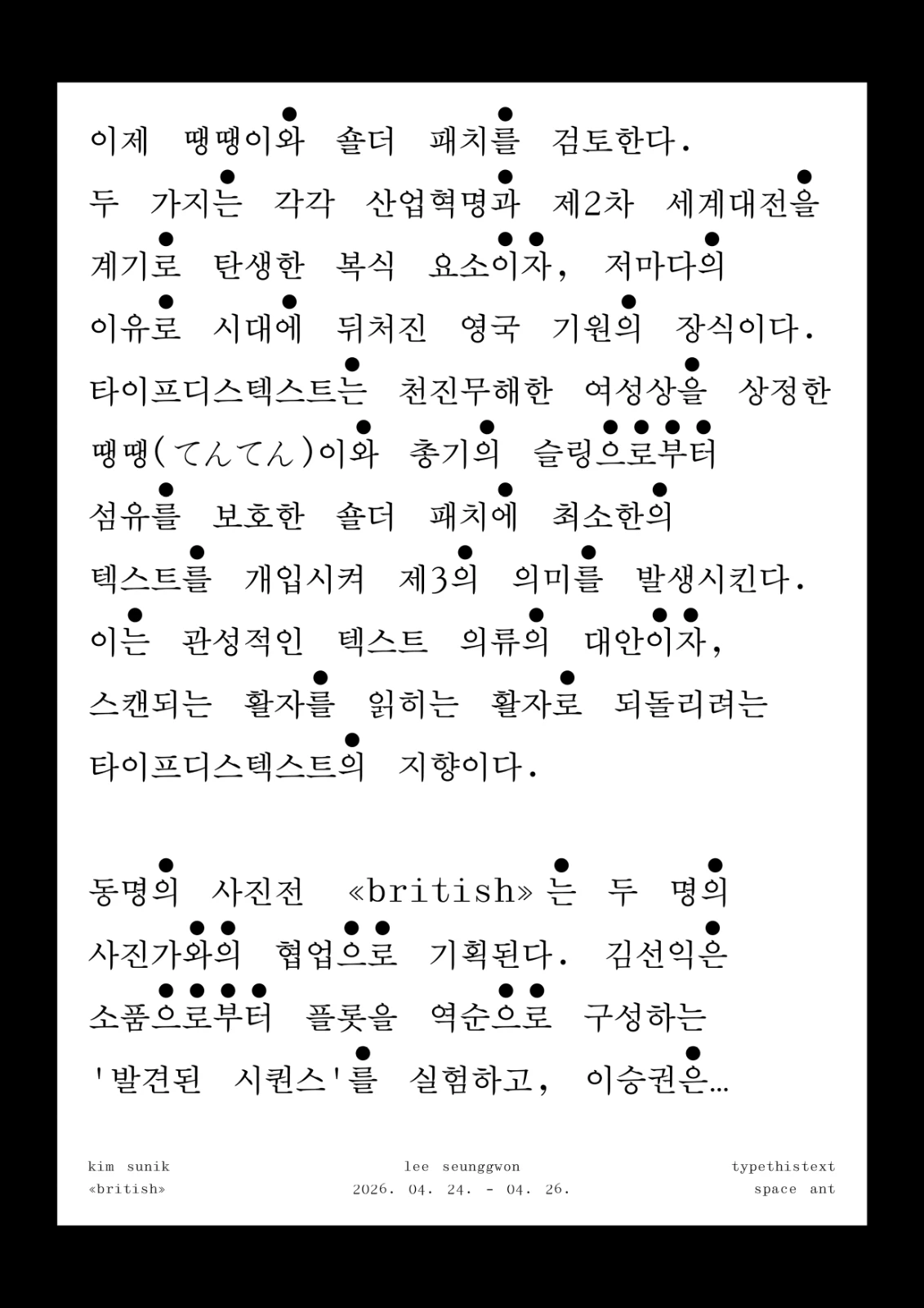
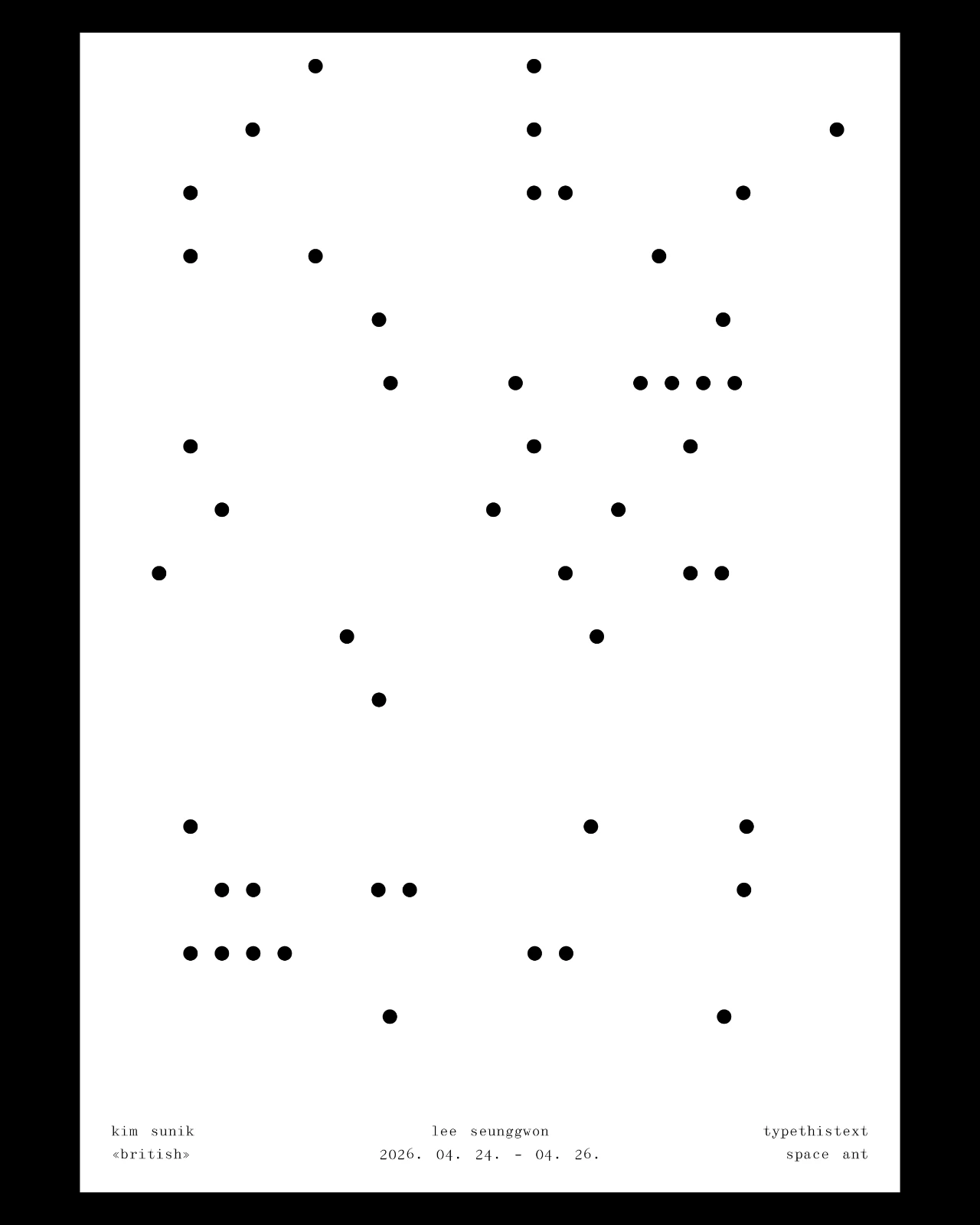
≪british≫의 포스터는 전시의 서문으로 기능하는 글을 전면에 배치한다. 전시가 도트 무늬, 즉, 땡땡(てんてん)이와 숄더 패치처럼 원래는 장식적이거나 부가적 요소, 기능적 요소를 전면에 놓고 제3의 의미를 발생시키듯, 이 포스터 역시 텍스트 안에서 비슷한 방식을 취한다. 권점(emphasis mark)은 일반적으로 특정 글자나 단어를 강조하거나 주목시키기 위해 쓰이는 표시다. 이 포스터에서는 권점을 의미의 중심이 되는 단어가 아니라 문장의 조사 위에 찍는다. 문장을 지탱하지만 보통은 주목되지 않는 요소를 일부러 전면으로 끌어올린 것이다. 서문은 읽히는 글에 머물지 않고, 권점의 분포를 통해 모종의 땡땡(てんてん)이 패턴을 형성한다. 이 패턴은 이후 다른 매체와의 배치 관계를 이루거나, 다른 이미지 위에 중첩되어 관계를 맺으면서 제3의 의미를 연속적으로 생성할 수 있다. 의뢰: 타이프디스텍스트(ttt)
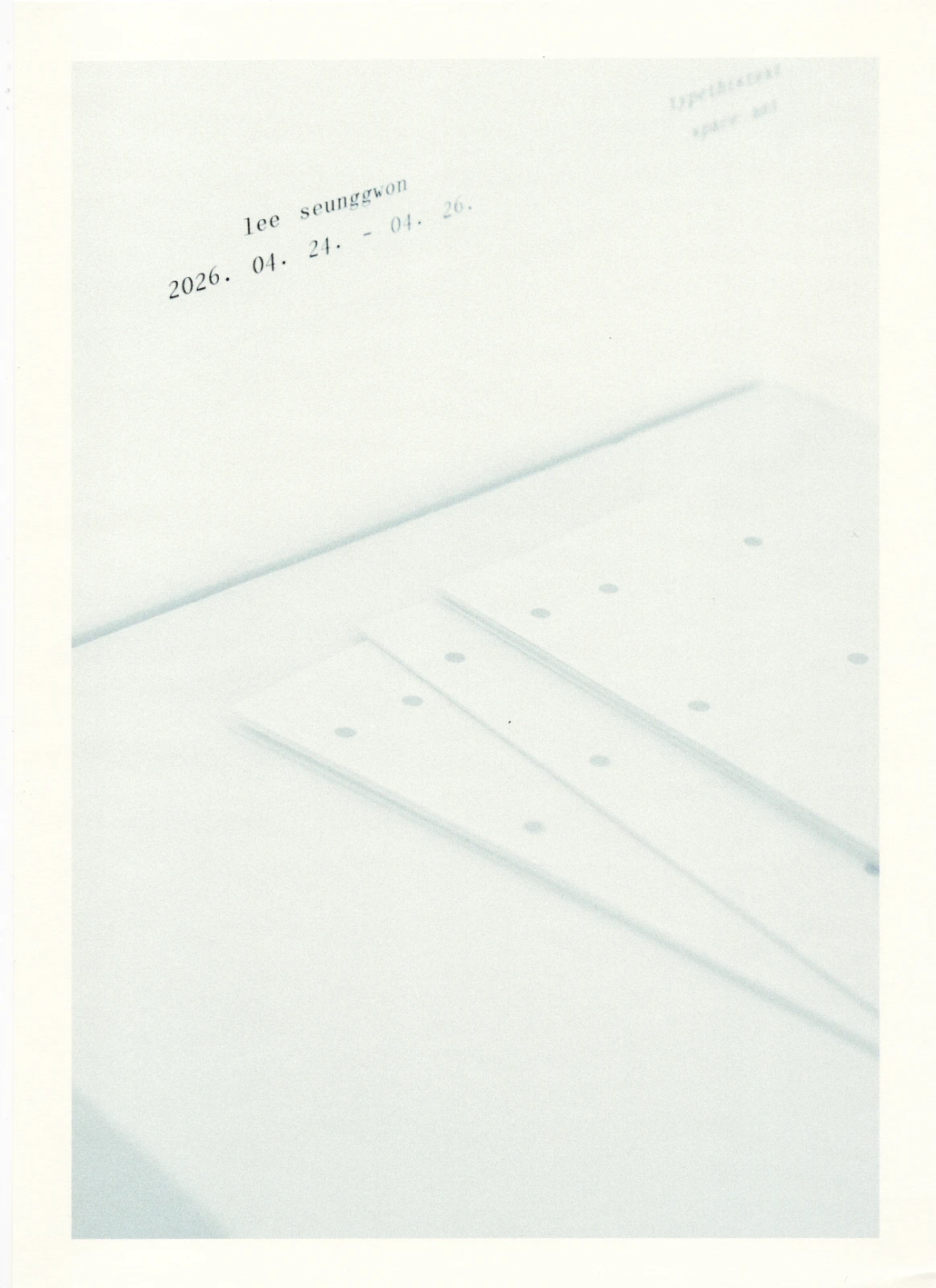
전경 사진: 이승권
The poster foregrounds the exhibition’s preface. Just as the exhibition brings decorative or functional elements such as polka dots and shoulder patches to the front to produce a third meaning, the poster adopts a similar strategy within the text itself. Instead of emphasizing key words, the emphasis marks are placed on grammatical particles—elements that usually remain unnoticed while supporting the sentence. In this way, the text becomes not only a preface but also a polka-dot-like pattern, one that can overlap with other images and enter into new relationships with other media to generate further meanings. Client: typethistext(ttt)
Photography: Lee Seunggwon